The burial rate each year is shown in figure 1. The effect of the great plagues towards the end of the 16th century and between 1650 and 1670 are strikingly evident. If the average normal death rate is taken to be around 10 persons (average taken between 1750 and 1800) which is compatible with a population of 500 with a life expectancy of 50 years, then there were an excess of 270 deaths above the average, or over half the population, between 1650 and 1670. At times, there were three burials per day. Note that records for 1601-1621 and 1720-1724 are missing.

Figure 1

Figure 2
Since from 1797 the burial records include the age of the deceased, it is possible to do some interesting statistical analysis on the population of Crosthwaite and Lyth.
A number of the burial entries are for persons from neighbouring parishes – Crook, Winster, Underbarrow, Helsington etc., so the population numbers cannot be contained within a specific geographical area.
The latest date for analysis is 1925. After this date, there is a possibility that people are still alive, and therefore do not appear in the burial records. In addition, cremations will not appear in the burial record unless the ashes are scattered within the graveyards.
Figure 2 shows the population count, rising from 450 in 1800 to 580 in 1910.
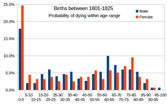 Figure 3a |
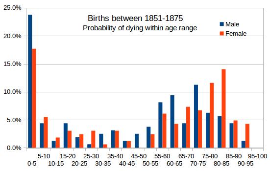 Figure 3b |
 Figure 3c |
 Figure 3d |
Figure 3 shows the probability of dying within a certain age band, if born between 1801 & 1825 (figure 3a), 1851 & 1875 (figure 3b), 1876 & 1900 (figure 3c) and 1901 & 1925 (figure 3d). The histograms compare male and female mortality.The high rate of infant mortality is very evident. Although many women died during childbirth, and specific instances of this can be found in these records, this is surprisingly not evident in these graphs, where one would expect to see it. On the other hand WW1 casualties are noticeable (confirmed by careful analysis) in figure 2c. A similar spike may be seen in figure 2d. Initially it might be thought that this is due to WW2, but a closer examination shows this not to be the case, with only two of the deaths occuring during the war years.
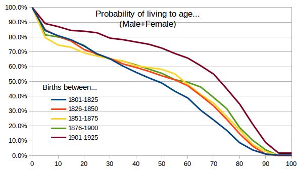
Figure 4
Figure 4 shows how life expectancy increased slowly for births in the 19th century, but improved dramatically for births in the first quarter of the twentieth century. Somebody born in the first quarter of the nineteenth century would have just a 50% chance of living to the age of 50, but for somebody born in the first quarter of the twentieth century, they would have a 50% chance of living to the age of 73. This is undoubtedly due to significant advances in medicine in the second half of the twentieth century.
Figure 5 compares births in the first quarter of the nineteenth century with births in the first quarter of the twentieth century, but with male and female differentiated. Figure 5a is for all births, but figure 5b ignores infant mortalities. I.e. the graph shows the probability of living to a certain age after survival to the age of 5. It is interesting that life expectancy was about the same for both males and females born between 1801 and 1825, but noticeably better for females, when compared to males born between 1901 and 1925.
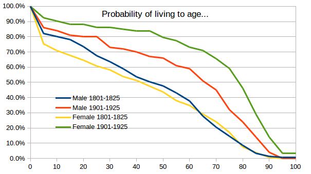 Figure 5a |
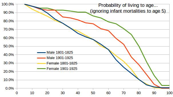 Figure 5b |